Teaching with Contemporary Art
Who Am I, in Color?

Fifth grade student uses different solutions of safe household chemicals to change the pH and thus color of cochineal powder.
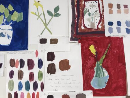
When I was asked the title question for a class assignment in college, I didn’t have to mull over my response. Spreading my brand new Color-aid papers on the table before me, I pulled a palette together. I created five medallions: concentric circles of maroon, fuchsia, a warm yellow (the color of my living-room walls), and a light turquoise (like the drip of paint that graced my painting shoes for years). As a painter, I use color to describe my perception of people, relationships, narratives, and the spaces and places that contain them. In my sketchbook, painted color swatches help me to plan, remember, and reproduce color combinations for my work.
But color changes in different light. Color changes with context. Color, as pigment, changes with time. What does color have to teach us? How can a study of color help elementary students access knowledge about the world and themselves?
I began my fifth-grade color unit by asking students what they already knew about color. Their answers reflected a basic knowledge: one can mix colors to make new colors, there are light and dark colors, some colors are beautiful, some are ugly, there are warm and cool colors, and some colors visually pop. In order to give students more direct access to the process of curriculum development and to knowledge of color that is meaningful to them, I asked them what they wanted to learn and compiled a list to drive the unit.
Their questions included:
- How do we see colors?
- What makes color?
- How many colors are there?
- What about new colors?
- How do we name colors? What are color names in different languages?
- What colors can we make? What combinations can we use for mixing?
- What colors can I use for different shapes? What shade do you use at what time?

After considering the cochineal color palette, this fifth grader was inspired to paint a market scene.
We examined Mary Heilmann’s painting Lovejoy using the “See, Think, Wonder” Visible Thinking strategy from Harvard’s Project Zero. This strategy guided students to make careful observations and interpretations and set the stage for inquiry about how artists use color in paintings. Students observed the variety of colors, lines, and shapes, noting how these attributes create 3-D illusions. They were reminded of sun catchers and stained-glass windows. They wondered why Heilmann made Lovejoy and how she picked the colors she included (and why there is only one little red shape). After viewing the Art21 short film on Mary Heilmann, Inspiration, we briefly discussed what we learned from the video, including Heilmann’s use of color based on The Simpsons cartoon.
Now it was time to access the science curriculum. I located a short, kid-friendly science video (“Why Do We See Color?”) to address the topics of pigments, light wavelengths, eye anatomy, and visual perception. This set the stage for our exploration of historical and contemporary materials in paintings and a discussion of color, pigments, binders, and scientific discovery. Using cochineal insects as a case study, I traced the use of this material in pre-Columbian indigenous art and its circulation around the world during the Spanish Colonial era (and in my artwork). With my students, the hands-on exploration of pigment and paint included grinding cochineal insects to a powder with a mortar and pestle to create an analogous palette of oranges, reds, and violets, depending on the pH of the household solution in which it is dissolved. Students then created paintings with their homemade paint.
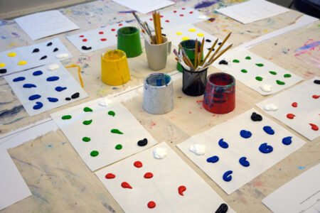
Subsequent exercises in color theory included creating as many different colors as possible, producing two color wheels using at least two different sets of primary colors to create secondary colors. As they worked, students were asked to name a few colors they created and write down the feeling each color invoked in them, for later reference. Students experimented with color and composition using Olivia Gude’s Free Form Color Investigation, a painting produced with primarily one hue, its complement, and an accent color.
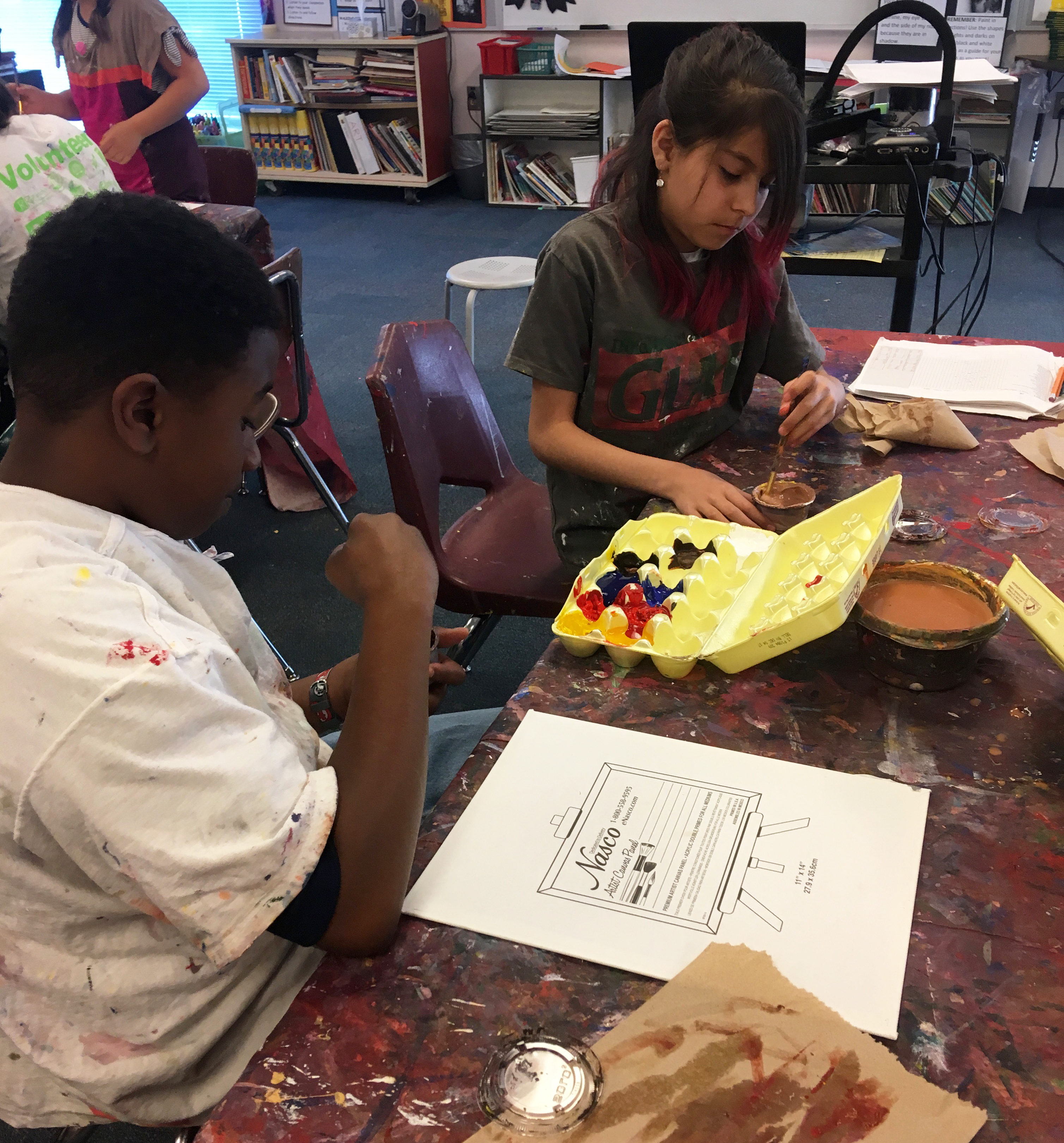
We concluded the unit with a project about selfies. To see how and why artists use photographs in their work, we watched clips from Art21 films about Tim Hawkinson and Oliver Herring, with a focus on process and materials. After a discussion of the positive and negative aspects of selfies and why people take them, students took selfies in class. They mounted the printed photographs on canvas and painted acrylic self-portraits using neutral colors as skin tones. Students acknowledged that it was easier to focus on the technical aspects of painting and color if an image was already there and that selfies, while looking cool, can be used to express themselves and their emotions.
Referring to the students’ recent knowledge about pigments, color and light, I introduced the topic of skin color with a focus on melanin as pigment and its relation to sunlight. In order to address how judgments are attached to skin tone, we viewed Angelica Dass’s TED talk about her photographic skin-tone project Humanae and her experiences with skin color in her family, school, and larger society. Kerry James Marshall’s 1994 painting Many Mansions served as an alternate interpretation of skin color; students noted how the artist rejected the use of realistic color to show a sense of community.
Utilizing their scientific, expressive, and experiential knowledge of color, students painted their selfie images and chosen backgrounds. Some students used color to reveal countries of origin, in depictions of flags behind their faces. For others, rhythms of color and pattern reflected their achievements in music. For one portrait, a monochromatic violet indicated some introspection. Given access to creating a curriculum on color, these students began a multifaceted reflection on the question of what color means in their lives.


