Deep Focus
The Timeless Relevance of Alfredo Jaar’s “A Logo for America”
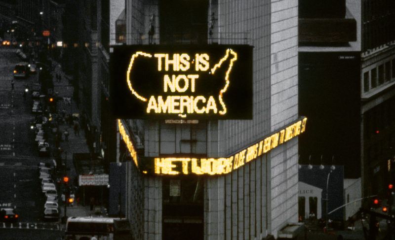
Alfredo Jaar, “A Logo for America,” 1987. Spectacolor animation, Times Square, New York, 1987. Presented as part of Public Art Fund’s exhibition series “Messages to the Public.” Courtesy Jane Dickson and Public Art Fund, New York.
The pioneering Public Art Fund exhibition series, Messages to the Public, introduced artists in the 1980s to the technology of mass communication, providing them with the means of transmitting their ideas to an estimated 1.5 million viewers per day. Running from 1982 to 1990, the exhibition initiative featured ninety artist-designed computer-generated messages created specifically for the 20-by-40-foot Spectacolor electronic light board in Times Square, in Manhattan. Each month, a new thirty-second message by a different artist was wedged into a twenty-minute loop of computer-animated commercials that was broadcast from 8:00 a.m. to 11:00 p.m. The messages addressed topical and often urgent political, social, and environmental issues, ranging from the AIDS crisis to apartheid. Messages to the Public formed a key part of Public Art Fund’s commitment to media-based artworks and paved the path for a long history of transforming the city’s ubiquitous advertising spaces into exhibitions, a practice that the organization continues today.1
Compared to its present over-stimulating sea of bright digital screens, Times Square in 1982 had mostly static billboards and was relatively subdued: the enormous, new, glitzy Spectacolor light board towering over the 42nd Street intersection was the only digital ad platform on the old Allied Chemical building and commanded viewers’ attention. At the time, the light board’s manufacturer boldly stated, “The computer is the artistic frontier of the next decade.”2 The very first Messages to the Public project provided Keith Haring with a platform to transfer his iconic figure drawings from the underground subway to the elevated, animated board. Jenny Holzer, whose 1982 message was her first attempt to convey her written material through electronic media, was one of the many artists featured in this exhibition series who went on to further explore this format in their artwork. The series promoted an exchange of the latest visual ideas and concepts between artists, art directors, advertisers, and computer technicians, who worked together to explore the then-emerging technology—new to many of the artists—and its potentially great impact.
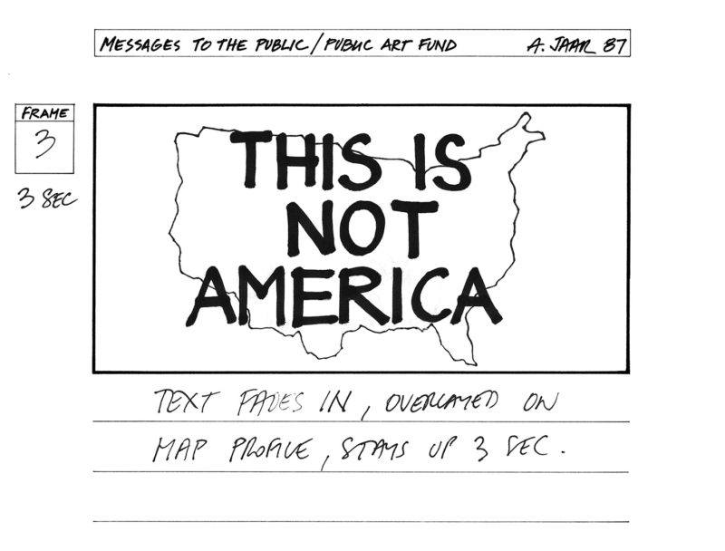
Original drawing for Alfredo Jaar’s “A Logo for America,” 1987. Courtesy Alfredo Jaar.
In 1987, Alfredo Jaar, a thirty-one-year-old emerging artist who had moved to New York five years earlier from his native Chile, was invited to create a message for the series. The resulting work, A Logo for America, developed from Jaar’s realization that the name “America” was used incorrectly by people in the United States to refer to their country and not to the entire continent. As a response, Jaar created a work that overtly addresses what he has called, “the power structure that frames the relationship between the US, that (sic) co-opts for itself the name ‘America,’ and the ‘other’ countries of the American continent.”3 A Logo for America has become Jaar’s best known and most reproduced work to date, in part because the meaning of “America” is still contested today.
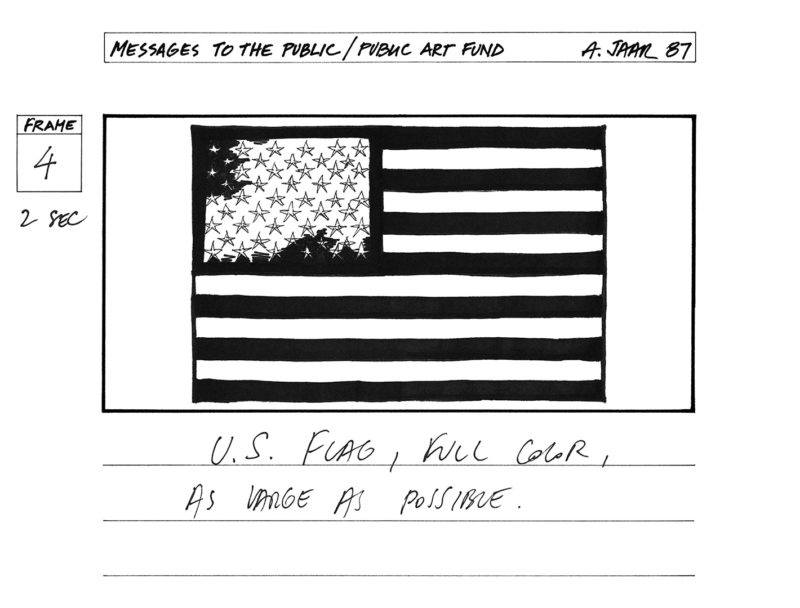
Original drawing for Alfredo Jaar’s “A Logo for America,” 1987. Courtesy Alfredo Jaar.
The animated work, initially designed by Jaar as eighteen hand-drawn frames, transposes a series of texts over images. It begins with an outline of the United States with an overlapping text, “THIS IS NOT AMERICA.” Subsequent frames show the United States flag becoming a line drawing with the overlaid text, “THIS IS NOT AMERICA’S FLAG.” The word “AMERICA” expands for the next few frames, and the letter “R” is transformed into a map of North and South America. The animation ends with the word “AMERICA” engulfing the screen with the letter “R” shaped as the map of the northern and southern American continents. Jaar’s work stands as a pointed reminder that the United States is one of many countries that make up the Americas.
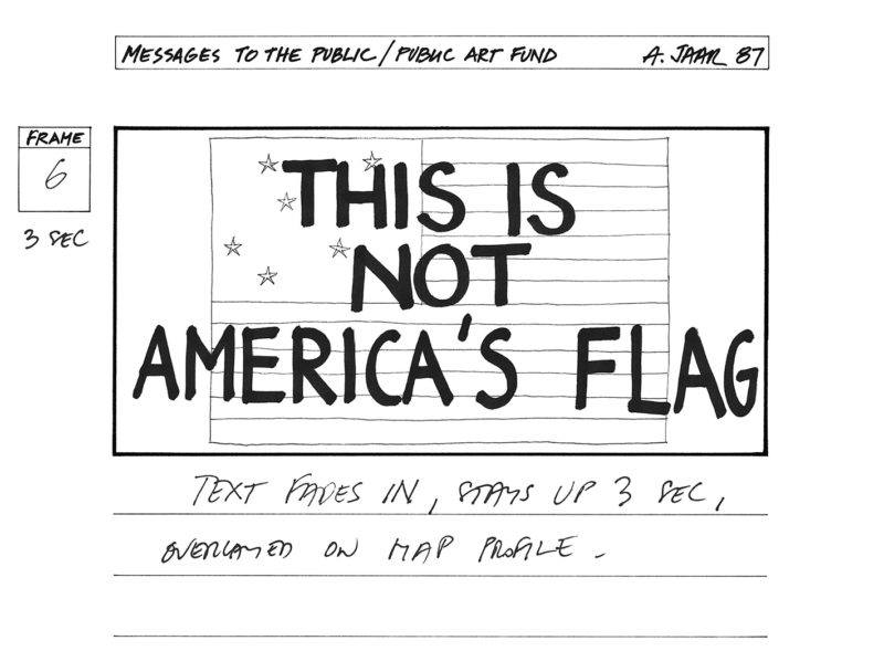
Original drawing for Alfredo Jaar’s “A Logo for America,” 1987. Courtesy Alfredo Jaar.
The United States’s monopoly of the word “America” suggests an erasure of the thirty-four other countries of the Americas. For Jaar, language is a reflection of a geopolitical reality; in order for the language to change, the geopolitical reality has to change.4 The artist, who is from South America (the “other”), “demands the simplest kind of recognition—that of being put on the map.”5 In 1987, his criticism of US domination stirred controversy, yet his activation of public space in the epicenter of New York City was a powerful form of social action that confronted the implications of boundaries.
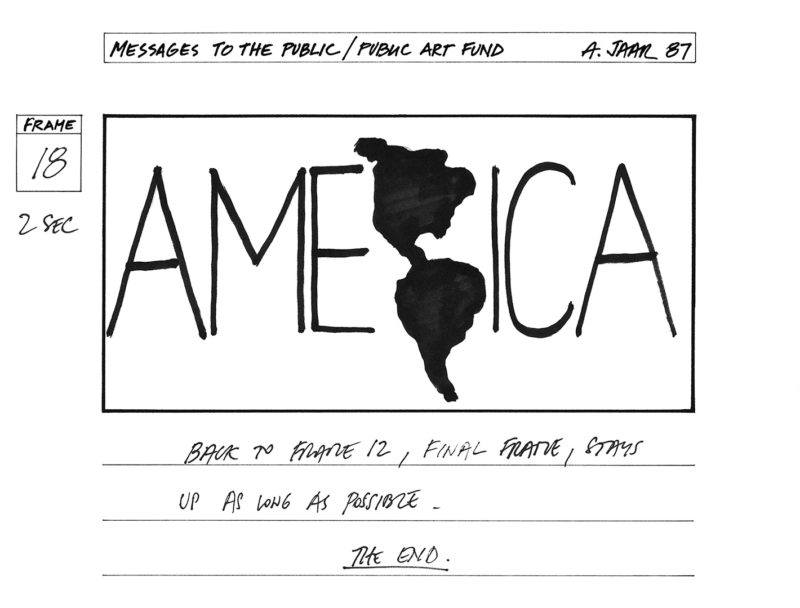
Original drawing for Alfredo Jaar’s “A Logo for America,” 1987. Courtesy Alfredo Jaar.
Ingeniously, in addition to the use of ad space and targeted messaging, Jaar incorporated the language of advertising in the title of the work by including the word logo, a term closely associating with marketing and branding. His title connects to the title, Messages to the Public, which was chosen by the artist Jane Dickson, who initiated this seminal series for Public Art Fund based on the propaganda potential of the project. At the time, Dickson worked for Spectacolor as an ad designer and computer programmer, and she conceived the idea and curated the program to display noncommercial art on the light board. In the same way that advertisers regularly used the Spectacolor board for commercial propaganda, Messages to the Public placed the power in the hands of artists, to communicate their messages directly to the public. It offered artists some access to the mainstream reach of electronic media that was traditionally provided only to private advertisers, and it permitted these artists to create works that helped to expand the notion of what public space truly is.
When A Logo for America was first presented, some viewers perceived it as an anti-American message rather than a call for change and inclusivity. In recent years, this seminal work has been exhibited extensively, from Bogota to Mexico City to London, underscoring its relevance in today’s global society. Remarkably, the meaning and interpretation of the work has evolved and morphed with each display, depending on two interconnected factors: the location in which it is shown and the sociopolitical circumstances of that location. In 2014 when it was presented in New York City, twenty-seven years after its debut, the topic of Latin American immigration was central to the conversation, as the Obama Administration was felt by many to be disappointing on the issue. In Mexico City in 2016, the work took on additional meaning, as a result of Trump’s xenophobic rhetoric and initiative to build a border wall to keep migrants out. For those who disagree with Trump’s policies, the work can be interpreted as signifying, “This is not the America that represents them.” With each iteration, the understanding of A Logo for America may grow and differ, yet its original intent is never lost since US dominance over the American continents is still in place. The work continues to act as a catalyst for open dialogue and to encourage free speech. The presentation of contemporary art on advertisement platforms in the public realm has the ability to reach broad and diverse audiences outside traditional art spaces and has the potential to influence social thought. In the words of the artist: “In spite of all the complexities and problematics of the art word, the spaces of art and culture are the last remaining spaces of freedom. And perhaps more so now than when the work was created.”6
1 Recent Public Art Fund exhibitions using ad spaces include Felix Gonzalez-Torres’s billboard Untitled, 1989 (2019), and two photography exhibitions by the artists Elle Pérez (2019) and Farah Al Qasimi (2020), presented on 100 JCDecaux bus shelters across NYC.
2 Spectacolor, Inc., Spectacolor Artists in Residence Program, 1981, Public Art Fund administrative files, Series V: “Messages to the Public,” Box 31, folder 7, The Fales Library and Special Collections.
3 Alfredo Jaar, “Artist statement for A Logo for America,” March 1987, Public Art Fund artist files, Series V: “Messages to the Public,” Box 28, folder 16, The Fales Library and Special Collections.
4 Alfredo Jaar, audio recording of artist talk at The New School, November 29, 2017.
5 Alfredo Jaar, “Artist statement for A Logo for America,” March 1987.
6 Alfredo Jaar, email correspondence with the author, February 11, 2020.
