Interview
“eXelento” and “DeLuxe”
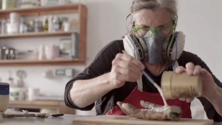
Ellen Gallagher at work on DeLuxe (2004–05) at Two Palms Press, New York, 2004. Production still from the Art in the Twenty-First Century Season 3 episode, Play. © Art21, Inc. 2005.
Artist Ellen Gallagher discusses her process and how she came to use collaged paper in her paintings.
ART21: How did arrive at collaging paper into your paintings?
GALLAGHER: I didn’t really come from a fine-arts background although I certainly went to museums as a kid. I came from a carpentry background. And I worked building a bridge (a floating bridge that has since collapsed). I worked in the saw yard where we built the molds that the cement was poured into. Basically, I built a box over and over again for months. So, when I went to art school, that was what I knew how to do, and that’s the way I built my canvases. I built a latticework grid and, over that, laid down very thin plywood and stretched the canvas over that. That way, I could sit on the canvas as I began gluing down sheets of penmanship paper, from top to bottom, left to right. Then I began drawing and painting into the pages, after they’d all been laid down in a skin. And they really became something that can be read both sheet-to-sheet and as an overall skin.
The lines of the penmanship paper sort of line up and, from a distance, almost form a seamless kind of horizon line. But up close, you see that it’s a kind of striated, broken grid. So, there’s this push and pull between the watery blue of the penmanship paper lines and the gestural marks made inside and around them. Penmanship paper is the found material that I always see as a reference to how you make your letters—what height, and where you dot your i—so, it’s always been a sign of gesture for me.
ART21: It seems like there’s a variation of this practice in the paintings from the eXelento show at Gagosian, especially in the use of the grid.
GALLAGHER: The large works at Gagosian are made in a way similar to the earlier penmanship paper works: they are built from found material. Now, the paper itself isn’t something that’s only a support, as it was in the earlier works. The paper is more readable, narrative. The characters exist within the support itself, the page.
I’ve collected archival material from black photo journals from 1939 to 1972, looking at magazines like Our World, Sepia, and Ebony. Initially I was attracted to the magazines because the wig advertisements had a grid-like structure that interested me. But as I began looking through them, the wig ads themselves had such a language to them—so worldly—that referred to other countries, Leshiba, this sort of lost past. I started collecting the wig ads themselves. And then I realized that I also had a kind of longing for the other stories, the narratives—wanting to bring them back into the paintings and wanting the paintings to function through the characters of the ads, to function as a kind of chart or a map of this lost world . . .
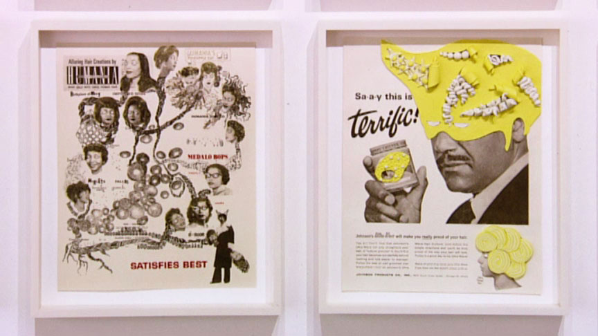
Ellen Gallagher. DeLuxe, detail, 2004–2005. Portfolio of 60 prints, edition of 20. Each print: 13 × 10 inches. Production still from the Art in the Twenty-First Century Season 3 episode, Play. Artwork courtesy of Two Palms Press, New York. Artwork © Ellen Gallagher. Photo © Art21, Inc. 2005.
ART21: How did they get conscripted?
GALLAGHER: My mind is also activated by the resistance of the material. The signs from a page of Ebony come with their own specificity and undeniable drag—their inability to be fully woven into my world. (Some model actually modeled these wigs in 1939!) The way they resist me—even before I manipulate them, or even after I blot out their original stylings with my own Plasticine blobby wigs—is that I know I’m looking at someone who was eighteen in 1939, as opposed to somebody who was eighteen in 1970. And even though all the signs have been uniform—or they’re now wearing my Plasticine form, and their eyes have been whited-out, and they are actually reproduced only in a kind of snapshot form and not the full advertisement itself—there’s a way in which their specificity is undeniable. And I find that really moving. That was what I felt after painting Double Natural (2002). No matter what I did, this person’s specificity was completely undeniable and unapologetic. I’m not only talking about this idea of capturing somebody in her youth from 1939. It’s also the specificity of that moment and what it is about that—just in her face—that registers that precise moment.
The paper itself—it’s not archival. It’s archival in the sense of historical, but it’s not a fine-art material. It will yellow and darken with time, so no matter what, it resists me in that way. No matter how I may try to build it into forms, or arc it, or cut it, it will darken and yellow, which I like. It has its own relationship to time.
ART21: There’s something poignant about figures stuck in time.
GALLAGHER: I am certainly moved by the idea. There used to be a store called A&S on 42nd Street that I would go to, to collect these magazines before 42nd Street got cleaned up. Among other magazines, there were Our World, Sepia, Ebony, and before about 1960, they’re pretty radical. They’re certainly not the Ebony magazine that I remember. There were interviews with Haile Selassie, a Richard Wright article next to a slasher text—they were dense. There was a necessity to them as a press, as a black press. They were entertainment, but they had a kind of urgency and a necessity to them. Also a worldliness—articles about drag queen balls in the Bronx, way before Jenny Livingston made Paris is Burning; nightclubs, like Lucky’s, that were of mixed race. There was this sense of loss that I felt, reading them, but also it was exciting, this collection of data and information. They seem radical compared to what I’m reading today.
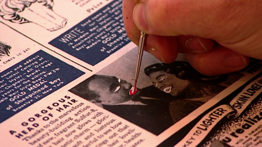
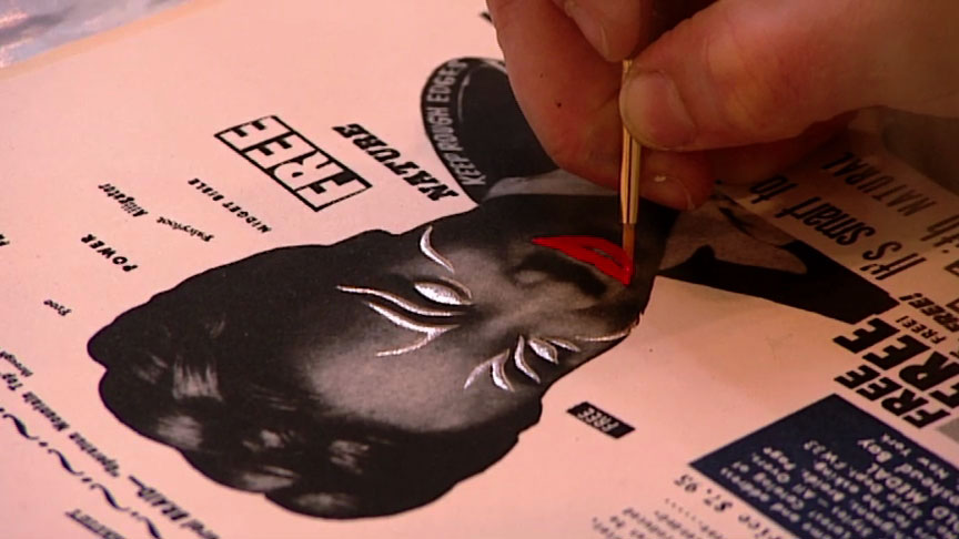
Ellen Gallagher at work on DeLuxe (2004–05) at Two Palms Press, New York, 2004. Production still from the Art in the Twenty-First Century Season 3 episode, Play. © Art21, Inc. 2005.
ART21: How exactly are the paintings made?
GALLAGHER: The material is archived. I make a disc, so it’s digital, which means what you’re looking at could be from an ad that was two inches or ten inches big—scale is really infinite and it can shift. The Plasticine is meant to allude to that idea of mutability and shifting, because Plasticine is used in animations and Claymation. Much the same way that penmanship paper is not a fixed material, the Plasticine will always continue to be vulnerable. Next, I build a grid of these 396 pages with this idea of what will relate to what. Then the sheets are cut. The wigs are removed with a knife, and then the sheets are glued down to the canvas. At that point, I begin at the top left corner and work my way across and down, building these blobby Plasticine forms. And they’re really built directly, wig to wig. There’s a kind of improvisation that happens. You’ll do about nine wigs a day or nine prosthetics a day. And they relate to each other over time. You can see shifts, which is also why I like to show more than one painting together, because they mark quite a long time period in making.
ART21: What excites you most about the process?
GALLAGHER: Using paper as support for printed material has always been central to my work, from the earliest penmanship paper works to DeLuxe, the print project at Two Palms Press, where I’m working in collaboration with printmakers and people building alongside of me.
What was exciting for me, here, was that what happens as whimsy in the drawings or as a decision made with an improvisational spirit—for example, when I would make a choice to blindfold characters or obliterate names underneath characters—would have to be structured, so that it could be repeated twenty times. And it was exciting to see, repeated as a language, something that was usually a one-to-one experience. I would make these little squares, and they would then be hand-cut and traced, so each sort of whimsical obliteration or recovery would be created into a kind of structure or language, back and forth. That was really exciting, in terms of looking at my work and my language and having it mean something even in its refusals to be completely readable. There’s this call and response that you actually feel directly as you’re working in this kind of collaboration.
I really get excited by this idea that a printed material can be so widely distributed. The black press was widely distributed and there is a great American history of manifestos. I was always jealous of writers because their story could be in so many different hands—it didn’t have to occur only in a gallery or a museum. There is a possibility for distribution and freedom.
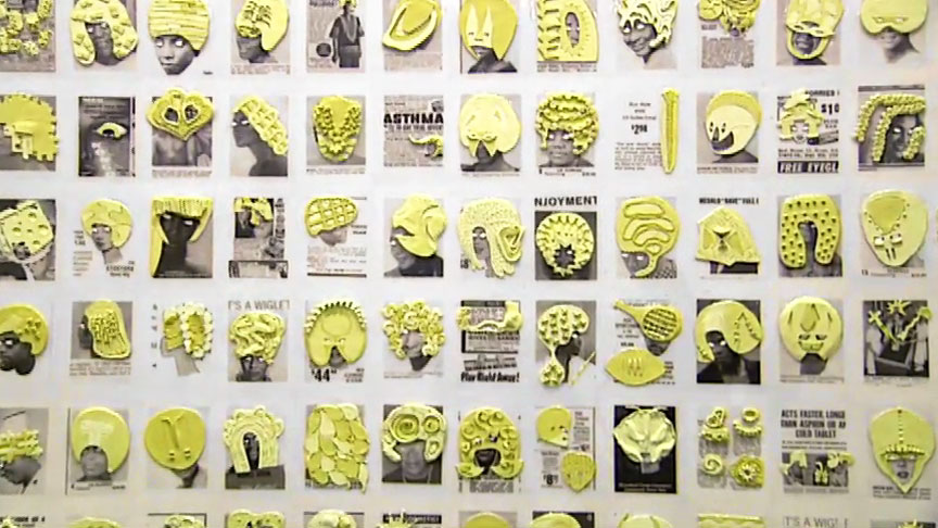
Ellen Gallagher. eXelento, detail, 2004. Installation view at Gagosian Gallery, New York, 2004. Plasticine, ink and paper on canvas; 96 × 192 inches. Production still from the Art in the Twenty-First Century Season 3 episode, Play. Artwork courtesy of Gagosian Gallery, New York. Photo © Art21, Inc. 2005.
ART21: Is there anything about your work that needs to be debunked?
GALLAGHER: Debunked . . . hmm . . . What’s seen as political in the work is a kind of one-to-one reading of the signs, as opposed to a more formal reading of the materials, how it’s made, or what insistences are made. I think people get overwhelmed by the super-signs of race when, in fact, my relationship to some of the more over-determined signs in the work is very tangential. What I think is more repeated than that, in the work, is a kind of mutability and moodiness to the signs. And that’s more what I think the work is about than a one-to-one reading of the signs, however over-determined they may be. You may think that’s what you’re supposed to be translating. In fact, it’s this other thing, which requires a kind of confidence that you have to enter that realm. And I think that’s where you can talk about race in my work—that idea of the abstract “I”—what it means to look at somebody who was eighteen in 1939, whatever she was. That’s specificity. It’s impossible to know who that was. But try anyway to have some kind of imaginative space with that sign. I think that takes more balls than to just understand it as some kind of critique of black hairstyles.
ART21: Talk about the elements of joy, pleasure, and beauty in your work.
GALLAGHER: I think maybe it’s hard for some people to look at a grid of wig advertisements or a group of women. They might be able to see the [Some Girls] album cover, but they don’t have the depth that [the artist] had when he looked at that and thought those women were beautiful and altered them. Sometimes it’s hard for people who don’t make things to understand labor, joy, attention, and whimsy. But it’s in the work—I don’t think it’s something I need to explain.
This interview was originally published on PBS.org in September 2005 and was republished on Art21.org in November 2011.


