Interview
Engineering “The Morning Line”
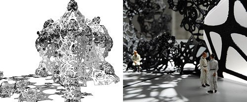
The Morning Line, preparatory sketches. Matthew Ritchie, Aranda/Lasch, and Daniel Bosia & Arup AGU. Models for The Morning Line, 2008.
Architect Benjamin Aranda, of Aranda/Lasch, discusses his contribution to artist Matthew Ritchie’s anti-pavillion project The Morning Line (2008), produced in collaboration with engineer-architect Daniel Bosia & Arup AGU, and physicists Paul J. Steinhardt and Neil Turok.
ART21: What conceptual challenges emerged while working on The Morning Line (2008)?
ARANDA: One of the great meetings we had on this project was with the physicist Paul J. Steinhardt, whose theories on the universe influenced the structure of the project. Steinhardt is the physicist who developed the cyclical model of the universe, which is an alternative theory of how the universe was formed with multiple big bangs.
It was a landmark meeting for us because Steinhardt confirmed a suspicion we all had: that at the root scientific breakthroughs—what underlies them—is an enormous amount of intuition. He said that while science is very empirical, some of the initial breakthroughs are formed through these very intuitive moments that are then substantiated through more empirical calculations and research.
I would say this is equally true of how we have approached the The Morning Line project and also what we’ve learned from it. It would be typical to think that the architect would handle the structural or geometric properties of the project, and the artist would deal with the overarching concepts and maybe some of the more expressive sides of the project. But those sort of divisions really broke down from almost the beginning. Matthew thinks very architecturally and approaches a lot of geometric problems as we do, which is both as a structural issue but also as issues of artistic expression.
Any time you’re dealing with complexity and how geometry yields complexity—which can be thought of as an empirical or scientific endeavor—it’s also very much an aesthetic or intuitive endeavor. We were able to learn from Matthew, in a very kind architectural sense, and I would also like to think that intuition was really sharpened in terms of really how to draw. While Matthew was producing these drawings, we really learned a lot about drawing in a way that maybe our education hadn’t taught us.
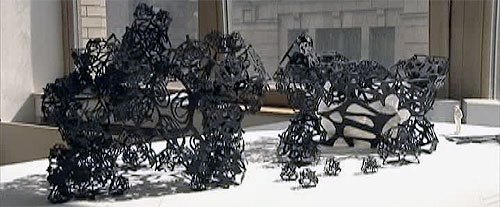
Matthew Ritchie, Aranda/Lasch, and Daniel Bosia & Arup AGU. Models for The Morning Line, 2008. Art21 production still, 2008.
ART21: How did you become involved in The Morning Line with Matthew Ritchie? What was your role as architects and artistic collaborators on the project?
ARANDA: We were asked to work with Matthew to figure out a way that his drawings could become structural, scalable, and also in a funny way, modular. We worked for a long time to develop a geometric system that could solve all of those issues. The initial problem we were asked to address had to do with Matthew’s approach (as I understand it) to almost all his work, which is how to take the artist’s brushstroke or line and turn it into something that can be almost like a piece of information that can scale infinitely.
So what we did is develop a geometric system that is about infinity and is about a kind of three-dimensional fractal. These study models right here are actual prototypes for this anti-pavilion. It’s one piece; it’s one drawing. Every line on this structure connects into every other line. The reason for that are twofold: one, it becomes more self-structural or something that can support itself; but also it means that every single shape is repeated many times throughout the structure. It’s the only shape in the project.
We call this shape a tetra, because it has four primary faces. And on every side of this shape is one of Matthew’s drawings. And every time Matthew would draw each of these drawings, he would do so following certain rules. For instance, every time the drawing came to an edge, it had to come to a certain point so that on this shape all of the drawings meet all of the other drawings. In a way it becomes like a brick, but a special kind of brick. When bricks are put together, when the structure grows, it grows in such a way that the bricks form arches, and these arches in turn form a kind of network, and the network itself forms these spaces. These spaces can then be occupied and programmed. And that’s maybe why it’s kind of an “anti-pavilion.” The way it’s programmed with images and sounds was really something that was found by working with the system; it wasn’t something that was imposed. It’s meant to be complex, collaborative structure.
For us, as architects, the very special thing about this geometry is that it can also scale. So if I take this shape and scale it down about two and a half times, it sits right on top of itself. And you can keep on doing that, you can keep on going forever if you wanted, both larger and smaller. It’s the idea that ultimately we can go as big as is structurally possible and as small as is feasible. Conceptually, it’s a project that confronts these limits.
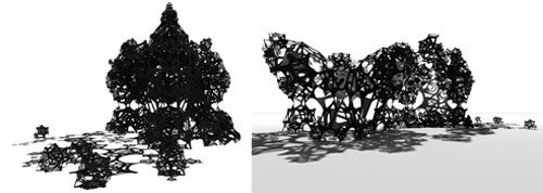
Matthew Ritchie, Aranda/Lasch, and Daniel Bosia & Arup AGU. Perspective drawings for The Morning Line, 2008.
ART21: You described the project as a kind of “anti-pavilion”…
ARANDA: It can be considered an “anti-pavilion” because of how it’s built up and how it falls apart. The drawings change from one side of the structure to the other. On one side they’re highly crystalline and triangulated, and as they move across the structure they become much more loopy. From the perspective of the type of drawing that occupies the geometry, it becomes more chaotic. Structurally though, the drawings are performing the same architectural function; they’re taking the same loads. We play around with the geometry in different ways so that as it moves across and becomes more chaotic, the geometry itself starts to loosen up and break down. This probably sounds like a kind of insider, architecture-speak, but actually it’s what we’ve learned to use in the studio here. It emerged from the process of working.
This interview was originally published on the Art21 Magazine in 2008.
