Interview conducted for Art21 in February of 2023 by Jurrell Lewis. All photography courtesy the artist and Steve Turner, Los Angeles.
In the Studio
David Leggett uses humor and levity to invite viewers into difficult conversations.

Jurrell Lewis – In your work you repurpose images and tropes from what you call Black Americana, could you give a description of what Black Americana is to you?
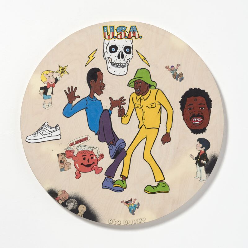
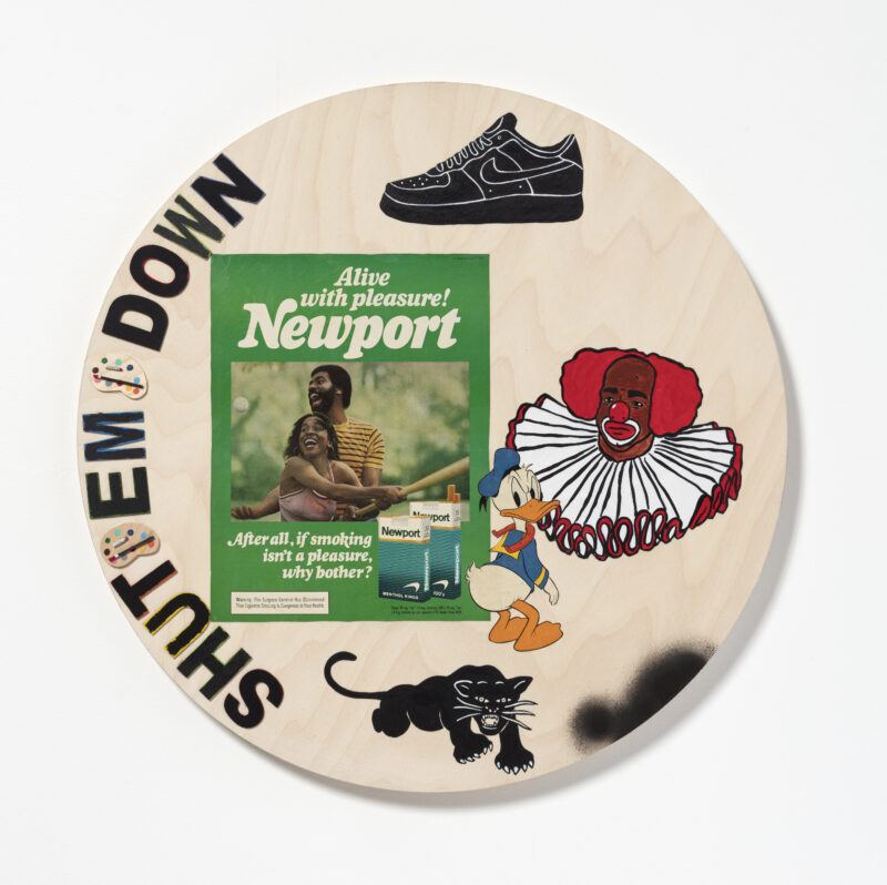
David Leggett – So, I collect a lot of stuff from our past. Some of the stuff that I have goes back to the early 1900s. It’s a lot of cast iron banks, a lot of early Uncle Ben and Aunt Jemima stuff. It’s advertising with Black faces, and it’s a lot of awful stereotypes, a lot of just terrible stereotypes of the time. What’s really interesting to me is how our faces were used to sell soap or rice and things like that, but we were still vilified at the same time.
I think this goes for a lot of Disney cartoons, where now there’s a different meaning than what I thought it had. Sometimes personal prejudice and racism were put into these cartoons, and those cartoons have gotten massaged throughout the years. That’s my interest in Black Americana; where if you look at it from 1920, you can clearly see that this was a mammy character or this was a very hurtful stereotype, then you bring it all the way to today, you wouldn’t necessarily see that. Over the years, the image of Aunt Jemima became less and less offensive to the point where it just looked like a normal Black woman on the bottle, but when you look at it from the beginning, this is clearly a mammy.
I’m wondering how you think about your own use of these images in your paintings, bringing remnants of a visual culture that is so violent into a contemporary context?
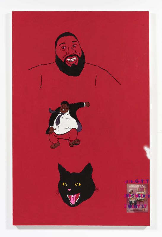
When I use these images, I’m careful. I never want Black people to be seen as this. It’s a tightrope walk because you don’t want the laughs. Everyone knows when someone’s laughing with you and then laughing at you. That is definitely a big issue, I don’t want to make it into some big minstrel show. “Look at us, we’re dumb, we’re silly.” I want us to look strong and to tell people this is not okay. But let’s talk about it. Let’s talk about it together. Let’s not put each other down when we look at these images. That’s not what I’m interested in.
I’m not interested in being someone’s teacher, and I’m not interested in hurting other Black people’s feelings with the language and the images. I try, and I hope I succeed at that. I’m not always sure. No one’s above critique. I love to hear feedback. I think sometimes we can just be too close to our own work to see when it’s not helping anyone.
In your work, you transform and recontextualize characters, bringing them into your own world and language. How do you think about that process?
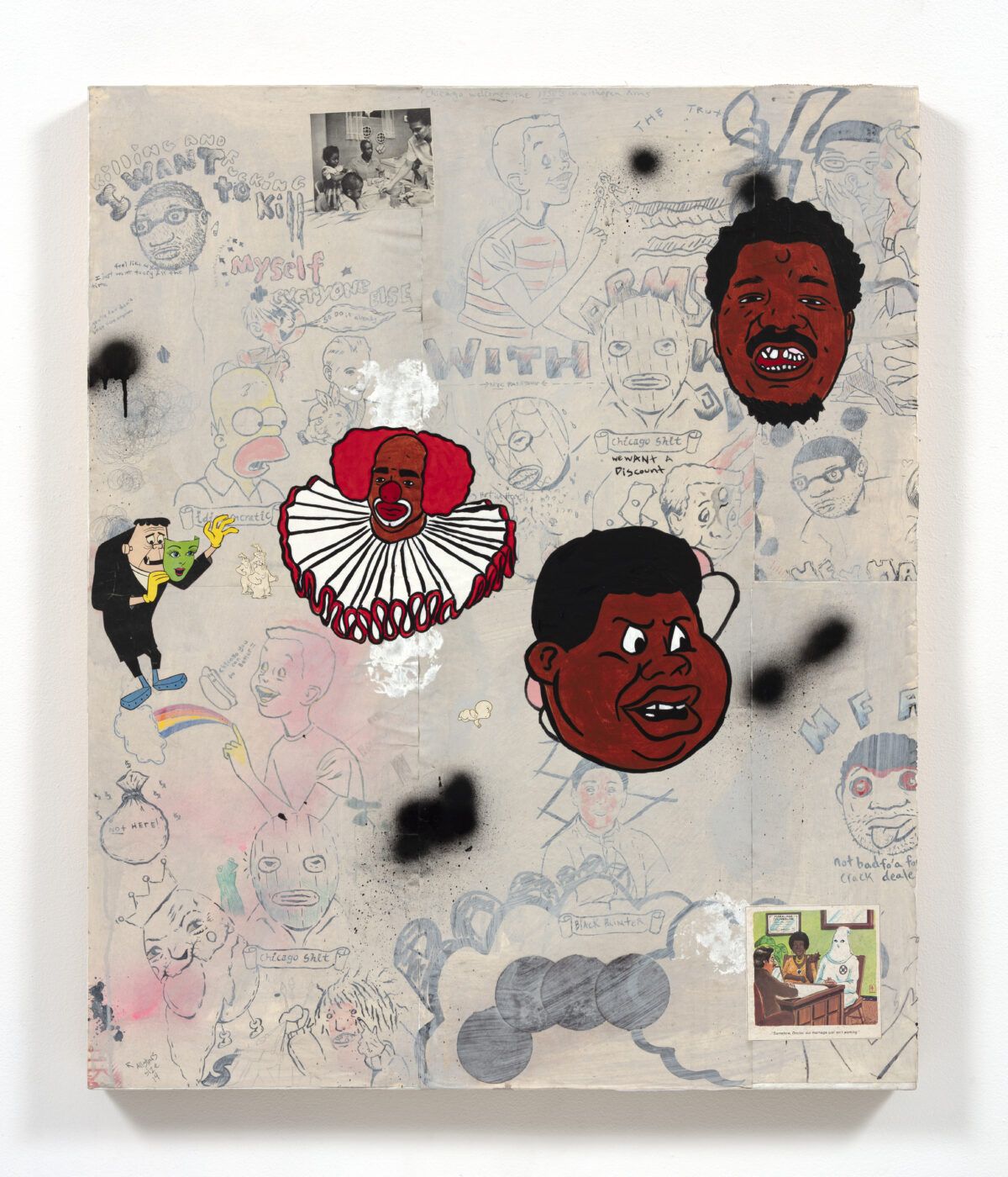
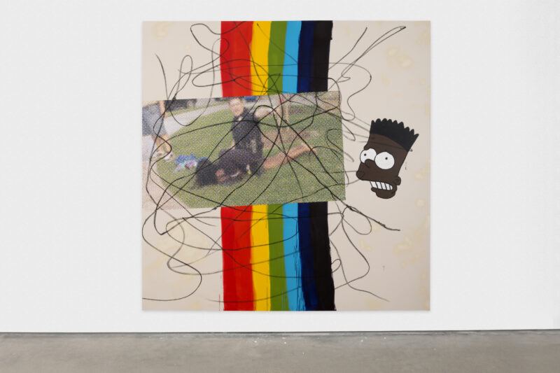
It’s almost like hip-hop, this is the remix, so you heard it, and this is the remix of it. The ‘Bootleg Bart’ — it’s a remix. I feel like Black culture, Black Americans, we do this where we take something that already exists in the world and make it ours. Let’s put our own spin on this. I think this is what hip-hop does well, sampling bits and pieces and putting your own interest into it.
That’s what I’m doing with Bart. Although this language existed when I was a kid, I can then, from there, push him a little further. My interest is how I could tell a story from language that already exists, and the goal is not to go, “That’s Bart Simpson.” The goal is to go, “That’s Black Bart Simpson.” This is a painting about the abstraction. This is a painting about Black culture using various different languages, different modes of talking about art and culture.
Could you talk about your use of text in the works?
I don’t really sketch things out, I usually write them down. I’ll think of a text, and I’ll put it in the notes feature on my iPhone. Sometimes I’ll write that text directly onto the canvas, or I’ll just use that as a springboard. For instance, “Invited to the cookout.” It’s like a phrase that Black people use for a ‘good white person.’ How could I use this phrase? I think that might have been the first time I used Black Bart in a painting, it’s Black Bart looking at that famous Texas pool party where a cop arrested a girl who really posed no threat to them. It was interesting because, again, I don’t want to add any misery to this, but this can be something we can talk about.
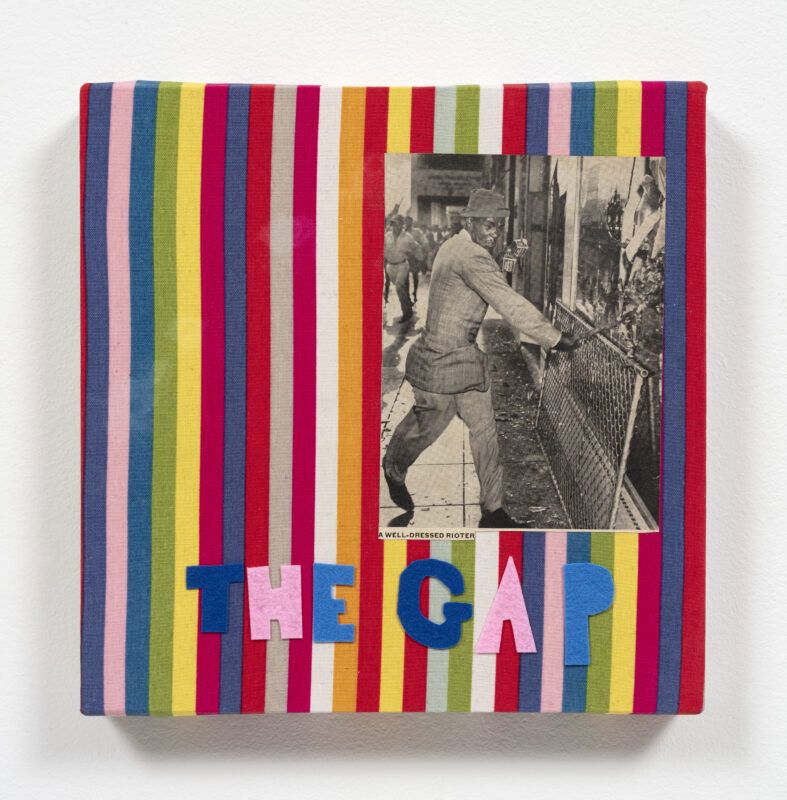
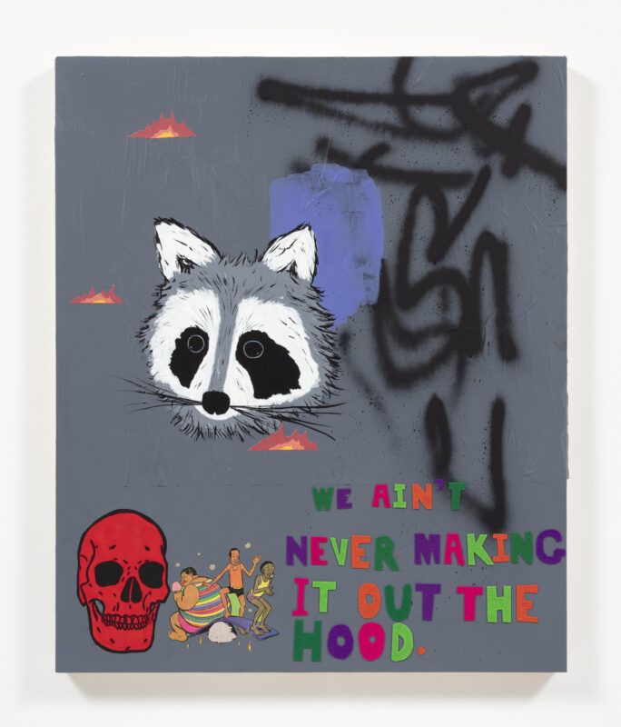
It’s how to balance. I’m going to use abstract elements. Using felt or using paint, a text that could be very heavy, like, “We are never going to make it out of the hood,” somehow when it’s in felt, and it’s in this candy rainbow, it doesn’t have that same hit to it. It’s like, “Huh, we are never getting out of the hood.” This is something that I think grew up hearing, “I’m not going anywhere, everything I need is right here.” The title of that painting is I was born here and I’m going to die here.
I think about how text can fit into a painting, where do you place it, do you put it at the bottom, at the top? How can this work? What colors to use? It’s a lot of different things that go into this. I have tons of felt in here, and I will cut these letters out all day, every day. I’ll just move them around the canvas, the panel. It’s never a one-shot deal. It has never been that. I think some things probably look easier than they really are. This is a lot of trial and error. I’ve been doing this for a while. I know what will possibly work, but it doesn’t always work.
Sometimes text doesn’t look good in the painting at all. I’ll have the text cut out for this big painting, and I’ll tape it on. I’ll try it multiple times, and it just won’t work. Sometimes I’ll use the oil bar or just paint directly and then just paint it out altogether because it doesn’t belong there. “Invited to the cookout” is a perfect example where I had text and it did not work in this painting. I tried so hard, it just didn’t work.
Your work addresses subjects like enslavement, minstrelsy, and policing, really directly and with a particular sense of humor. How do you balance complex and charged subjects with levity in your work?
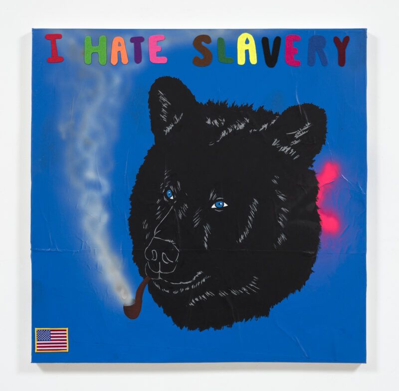
When I went to Skowhegan in 2010, I realized, “Oh, I don’t want to make misery porn.” I think the movie “Precious” had just come out when I went there and I was like, “I’m going to make paintings about ‘Precious.’” I made one painting. I said, “No, this is not it.” That movie, and that book as well, certainly, are a part of someone’s truth, absolutely. There are people who go through this, but do I need to add to this? I want to try to be funny. I want to try to be clever. How do I talk about something heavy but also not be gratuitous?
I don’t want to show police killing a Black person. That’s just too much. That’s not my interest, and I don’t want to just see blood and guts; that’s too much for me. So, how can I make my work talk about that but also talk about painting? Talk about color? How can I be humorous? How can I make this into a dialogue that people can talk about?
I use color, candy colors and bright colors. I think this comes from having an illustration background. This color makes you relax, it’s a soft, more pastel color. You wouldn’t think that would come with something about racism, or sexism, or homophobia. How can you use that to talk about things. Bring people in and then from there, they think, “That’s not what I thought this was, this big purple painting. This is actually pretty incendiary.”
I use craft materials, which for a lot of people are considered lowbrow materials. These are usually materials you see children use, but I think there’s so much you can do with it. Seeing Kerry James Marshall use glitter in his paintings felt so different to me. I know he wasn’t the first artist to use it, but to me, he was. I don’t really consider the stuff I do to be decorative, but definitely, decorative materials are another asset.
